Brand + Biscuits
Wednesday, 27 May 2015
Tuesday, 26 May 2015
Friday, 22 May 2015
Week 11 - Packaging mock ups
We printed out mock ups of our packaging to see how everything translated onto a 3D box. We made some adjustments after seeing how different the net appeared when you'd folded everything up. We rearranged some of the images and text, filled empty gaps and rearranged elements we just thought weren't sitting right. It was good to print our packaging to see how the colours worked off of the computer screen.
Thursday, 21 May 2015
Packaging Refinement
Pattern Refinement
We considered having the ingredients pouring into the mixing bowl but it just looked a little awkward
Brand history for the sides and also the use of social media icons to inform consumers of our social media presence. Not an integral part of our brand image but a necessary feature in the current market
Incorporating the Goodman Fielder Logo we felt was important
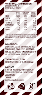
Nutritional and Contact info in a simple yet interesting sans serif font. Informative but not too boring
Marmite blurb.
Pineapple lumps blurb.
Jellytip blurb.
Wednesday, 20 May 2015
WEEK 11: NZ Made
Initial Idea to incorperate New Zealand made idea. However did not sit well with cookie and looked bad.
Addition of lines to make the font look more finger drawn in the flour dust
We also looked into if we were actually allowed to use the NZ Made Sticker
As our product is made in a New Zealand factory we are able to use the NZ Made sticker.
Tuesday, 19 May 2015
Thursday, 14 May 2015
Week 10 - More product development
Development of packaging graphics using inspiration from 1930's graphic design (with inspiration images located at the bottom). Graphic shapes and ribbon banners drawn from pictures from the internet of 1930's posters and also using the stamped effect from previous designs.
Subscribe to:
Comments (Atom)


